Electronic Duo, Akustikkoppler Tap Into The Past And Future With New Album p{ margin:10px 0; padding:0; } table{ border-collapse:collapse; } h1,h2,h3,h4,h5,h6{ display:block; margin:0; padding:0; } img,a img{ border:0; height:auto; outline:none; text-decoration:none; } body,#bodyTable,#bodyCell{ height:100%; margin:0; padding:0; width:100%; } .mcnPreviewText{ display:none !important; } #outlook a{ padding:0; } img{ -ms-interpolation-mode:bicubic; } table{ mso-table-lspace:0pt; mso-table-rspace:0pt; } .ReadMsgBody{ width:100%; } .ExternalClass{ width:100%; } p,a,li,td,blockquote{ mso-line-height-rule:exactly; } a[href^=tel],a[href^=sms]{ color:inherit; cursor:default; text-decoration:none; } p,a,li,td,body,table,blockquote{ -ms-text-size-adjust:100%; -webkit-text-size-adjust:100%; } .ExternalClass,.ExternalClass p,.ExternalClass td,.ExternalClass div,.ExternalClass span,.ExternalClass font{ line-height:100%; } a[x-apple-data-detectors]{ color:inherit !important; text-decoration:none !important; font-size:inherit !important; font-family:inherit !important; font-weight:inherit !important; line-height:inherit !important; } #bodyCell{ padding:10px; } .templateContainer{ max-width:600px !important; } a.mcnButton{ display:block; } .mcnImage,.mcnRetinaImage{ vertical-align:bottom; } .mcnTextContent{ word-break:break-word; } .mcnTextContent img{ height:auto !important; } .mcnDividerBlock{ table-layout:fixed !important; } body,#bodyTable{ background-color:#222222; } #bodyCell{ border-top:0; } .templateContainer{ border:0; } h1{ color:#202020; font-family:Helvetica; font-size:26px; font-style:normal; font-weight:bold; line-height:125%; letter-spacing:normal; text-align:left; } h2{ color:#202020; font-family:Helvetica; font-size:22px; font-style:normal; font-weight:bold; line-height:125%; letter-spacing:normal; text-align:left; } h3{ color:#202020; font-family:Helvetica; font-size:20px; font-style:normal; font-weight:bold; line-height:125%; letter-spacing:normal; text-align:left; } h4{ color:#202020; font-family:Helvetica; font-size:18px; font-style:normal; font-weight:bold; line-height:125%; letter-spacing:normal; text-align:left; } #templatePreheader{ background-color:#FAFAFA; background-image:none; background-repeat:no-repeat; background-position:center; background-size:cover; border-top:0; border-bottom:0; padding-top:9px; padding-bottom:9px; } #templatePreheader .mcnTextContent,#templatePreheader .mcnTextContent p{ color:#656565; font-family:Helvetica; font-size:12px; line-height:150%; text-align:left; } #templatePreheader .mcnTextContent a,#templatePreheader .mcnTextContent p a{ color:#656565; font-weight:normal; text-decoration:underline; } #templateHeader{ background-color:#FFFFFF; background-image:none; background-repeat:no-repeat; background-position:center; background-size:cover; border-top:0; border-bottom:0; padding-top:9px; padding-bottom:0; } #templateHeader .mcnTextContent,#templateHeader .mcnTextContent p{ color:#202020; font-family:Helvetica; font-size:16px; line-height:150%; text-align:left; } #templateHeader .mcnTextContent a,#templateHeader .mcnTextContent p a{ color:#007C89; font-weight:normal; text-decoration:underline; } #templateBody{ background-color:#FFFFFF; background-image:none; background-repeat:no-repeat; background-position:center; background-size:cover; border-top:0; border-bottom:0; padding-top:0; padding-bottom:0; } #templateBody .mcnTextContent,#templateBody .mcnTextContent p{ color:#202020; font-family:Helvetica; font-size:16px; line-height:150%; text-align:left; } #templateBody .mcnTextContent a,#templateBody .mcnTextContent p a{ color:#007C89; font-weight:normal; text-decoration:underline; } #templateColumns{ background-color:#FFFFFF; background-image:none; background-repeat:no-repeat; background-position:center; background-size:cover; border-top:0; border-bottom:2px solid #EAEAEA; padding-top:0; padding-bottom:9px; } #templateColumns .columnContainer .mcnTextContent,#templateColumns .columnContainer .mcnTextContent p{ color:#202020; font-family:Helvetica; font-size:16px; line-height:150%; text-align:left; } #templateColumns .columnContainer .mcnTextContent a,#templateColumns .columnContainer .mcnTextContent p a{ color:#007C89; font-weight:normal; text-decoration:underline; } #templateFooter{ background-color:#FAFAFA; background-image:none; background-repeat:no-repeat; background-position:center; background-size:cover; border-top:0; border-bottom:0; padding-top:9px; padding-bottom:9px; } #templateFooter .mcnTextContent,#templateFooter .mcnTextContent p{ color:#656565; font-family:Helvetica; font-size:12px; line-height:150%; text-align:center; } #templateFooter .mcnTextContent a,#templateFooter .mcnTextContent p a{ color:#656565; font-weight:normal; text-decoration:underline; } @media only screen and (min-width:768px){ .templateContainer{ width:600px !important; } } @media only screen and (max-width: 480px){ body,table,td,p,a,li,blockquote{ -webkit-text-size-adjust:none !important; } } @media only screen and (max-width: 480px){ body{ width:100% !important; min-width:100% !important; } } @media only screen and (max-width: 480px){ .columnWrapper{ max-width:100% !important; width:100% !important; } } @media only screen and (max-width: 480px){ .mcnRetinaImage{ max-width:100% !important; } } @media only screen and (max-width: 480px){ .mcnImage{ width:100% !important; } } @media only screen and (max-width: 480px){ .mcnCartContainer,.mcnCaptionTopContent,.mcnRecContentContainer,.mcnCaptionBottomContent,.mcnTextContentContainer,.mcnBoxedTextContentContainer,.mcnImageGroupContentContainer,.mcnCaptionLeftTextContentContainer,.mcnCaptionRightTextContentContainer,.mcnCaptionLeftImageContentContainer,.mcnCaptionRightImageContentContainer,.mcnImageCardLeftTextContentContainer,.mcnImageCardRightTextContentContainer,.mcnImageCardLeftImageContentContainer,.mcnImageCardRightImageContentContainer{ max-width:100% !important; width:100% !important; } } @media only screen and (max-width: 480px){ .mcnBoxedTextContentContainer{ min-width:100% !important; } } @media only screen and (max-width: 480px){ .mcnImageGroupContent{ padding:9px !important; } } @media only screen and (max-width: 480px){ .mcnCaptionLeftContentOuter .mcnTextContent,.mcnCaptionRightContentOuter .mcnTextContent{ padding-top:9px !important; } } @media only screen and (max-width: 480px){ .mcnImageCardTopImageContent,.mcnCaptionBottomContent:last-child .mcnCaptionBottomImageContent,.mcnCaptionBlockInner .mcnCaptionTopContent:last-child .mcnTextContent{ padding-top:18px !important; } } @media only screen and (max-width: 480px){ .mcnImageCardBottomImageContent{ padding-bottom:9px !important; } } @media only screen and (max-width: 480px){ .mcnImageGroupBlockInner{ padding-top:0 !important; padding-bottom:0 !important; } } @media only screen and (max-width: 480px){ .mcnImageGroupBlockOuter{ padding-top:9px !important; padding-bottom:9px !important; } } @media only screen and (max-width: 480px){ .mcnTextContent,.mcnBoxedTextContentColumn{ padding-right:18px !important; padding-left:18px !important; } } @media only screen and (max-width: 480px){ .mcnImageCardLeftImageContent,.mcnImageCardRightImageContent{ padding-right:18px !important; padding-bottom:0 !important; padding-left:18px !important; } } @media only screen and (max-width: 480px){ .mcpreview-image-uploader{ display:none !important; width:100% !important; } } @media only screen and (max-width: 480px){ h1{ font-size:22px !important; line-height:125% !important; } } @media only screen and (max-width: 480px){ h2{ font-size:20px !important; line-height:125% !important; } } @media only screen and (max-width: 480px){ h3{ font-size:18px !important; line-height:125% !important; } } @media only screen and (max-width: 480px){ h4{ font-size:16px !important; line-height:150% !important; } } @media only screen and (max-width: 480px){ .mcnBoxedTextContentContainer .mcnTextContent,.mcnBoxedTextContentContainer .mcnTextContent p{ font-size:14px !important; line-height:150% !important; } } @media only screen and (max-width: 480px){ #templatePreheader{ display:block !important; } } @media only screen and (max-width: 480px){ #templatePreheader .mcnTextContent,#templatePreheader .mcnTextContent p{ font-size:14px !important; line-height:150% !important; } } @media only screen and (max-width: 480px){ #templateHeader .mcnTextContent,#templateHeader .mcnTextContent p{ font-size:16px !important; line-height:150% !important; } } @media only screen and (max-width: 480px){ #templateBody .mcnTextContent,#templateBody .mcnTextContent p{ font-size:16px !important; line-height:150% !important; } } @media only screen and (max-width: 480px){ #templateColumns .columnContainer .mcnTextContent,#templateColumns .columnContainer .mcnTextContent p{ font-size:16px !important; line-height:150% !important; } } @media only screen and (max-width: 480px){ #templateFooter .mcnTextContent,#templateFooter .mcnTextContent p{ font-size:14px !important; line-height:150% !important; } } Digital PROMO Sent Via Haulix<!–
Electronic Duo, Akustikkoppler Tap Into The Past And Future With New Album
“There is a spooky quality in the music here, that undercurrent of danger, perhaps, which makes the music quite suitable for a film. Most of these pieces are mid-to up-tempo, so there is a fine sense of urgency here.”– Vital Weekly
FOR IMMEDIATE RELEASE
January 23, 2023
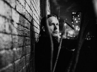
– Alles Muà Raus is the third album by Akustikkoppler, an ongoing collaboration between German artists, Matthias Schuster and Malte Steiner.
Inspired by the rough commercial industrial surroundings of Schusters Studio back then in Hamburg, Alles Muà Raus was produced on vintage and modern equipment. The two artists combine past and future to a sparkling, shimmering darkness.
Alles Muà RausIt is filled with hooky rhythms and non-keyboard electronics. But the music is very accessible and works well herein.
Malte Steiner and Matthias Schuster threw in each of their own decades of electronic music production to create the dark and surreal sound world of the album. The tracks from Alles Muà Raus were produced between 2008 and 2012, and have been remastered in 2021.
Alles Muà Raus is available NOW digitally and as limited edition of 300 12â LP in translucent vinyl with gatefold cover.
Akustikkoppler, an ongoing collaboration between Matthias Schuster and Malte Steiner. They met in Hamburg, Germany and started to make music together around 2004. They’ve followed no rules or genre constraints when they get together in the studio. Usually they improvise and record each track in one take without any overdubs.
Matthias Schuster started in the 70s with his band Geisterfahrer which combined the punk rock setup with electronic instruments. In his studio he recorded and mixed most of the bands for the Hamburg label ZickZack at the beginning of the 80s, many of these albums became defining for the German Postpunk / New Wave movement of the years 1977 to 1982 which resulted in the “Neue Deutsche Welle”. “New German Wave”, a genre of West German rock music originally derived from post-punk and new wave music with electronic influences.
Check Out Electro-Industrial Band, State Of The Union's Single, "Purgatory" Digital PROMO Sent Via Haulix Electro-Industrial Band, State Of The Union Unveils “Purgatory” FOR IMMEDIATE RELEASE: August 9th, 2023 -Electro-Industrial band, State Of The Union has unveiled […]


